
Chat optimization
Chat optimization
Housecall Pro* // Duration ~3 months
The Problem ✗
Our chat experience was shipped as an MVP (minimum viable product) so it had some major issues:
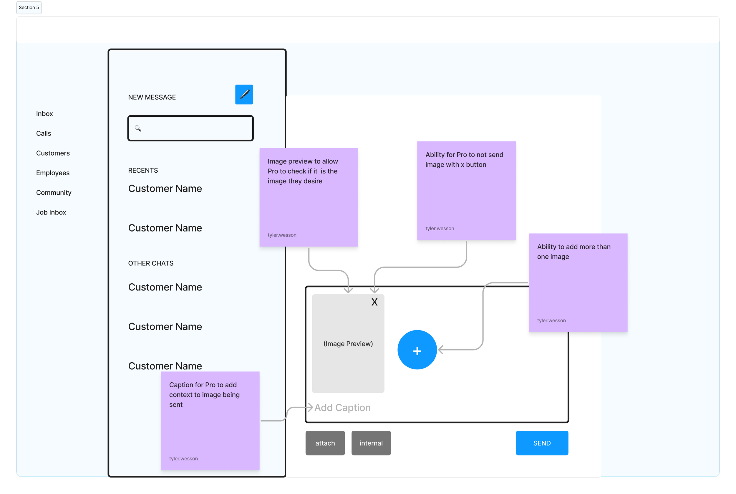
Images would send immediately after you selected one to attach
It was difficult to sort conversations and find older conversations
The Solution ✓
Recognizing these issues, I proposed these features:
Attached images populating the text box before sending
Ability to pin conversations
A search bar to find conversations
Results
✅ Designs approved by stakeholders and devs
✅ High fidelity designs were passed to the Innovation team
I served as the lead designer for this project. I collaborated in a squad consisting of my design manager, and product manager.
The process
The process
01 Research
To gather insights about current chat experience, I created a script to guide Pros through the product and conducted 3 live user interviews
After a few rounds of live user interviews, I gathered that:
1/3 Pros struggled to add employees to the chat
3/3 Pros wanted a better way to find older conversations
Pros were not able to select images without them immediately being sent- a major pain point
02 Feedback → Mid-fi mockups
🧠 After presenting the lo-fi designs to sr. designers and my product manager, I got some great feedback about my current designs:
Some of the outstanding critiques were:
Scalability— putting the benefits at the top of the Payroll page looked crowded, and Housecall Pro planned to offer even more benefits down the line.
Readability— The marketing team wanted to add 2-3 lines of copy per benefit, and my current designs would make that amount of text hard to read.
✅ Based on the feedback, I made a new design (below) of the layout with:
A separate page for the benefits to occupy, allowing room for more benefits down the line (to consider scalability).
Larger card sizes, to allow more space for marketing copy (solving the readability issue).
I used components from the design system to build the new cards, ensuring less work for the development team and visual consistency with other parts of the product.
03 Feedback (round 2 🥊) → Hi-fi Mockups and component building
🧠 After another round of presenting, I received more feedback:
Some of the outstanding critiques were:
Minimize scrolling— although the size of the cards allowed for more copy, I need to design the cards in a way that allowed Pros to see as much as possible with few scrolls
Interactions— What would the cards look like after the employee enrolled in benefits?
Future offerings— how do we advertise that more benefits would be available in the future within the suite?
✅ Based on the feedback, I made a new design (below) of the layout with:
New card sizes that could fit the same amount of text, but could stack in a single row
An after-state that communicated to the user that they have successfully enrolled, with space for relevant metrics
An ad banner to communicate future offerings.