
Chat optimization
Chat optimization
@Housecall Pro // Duration ~3 months
Helping HVAC specialists/business owners (aka “Pros”) improve communication with employees and customers with new chat features.
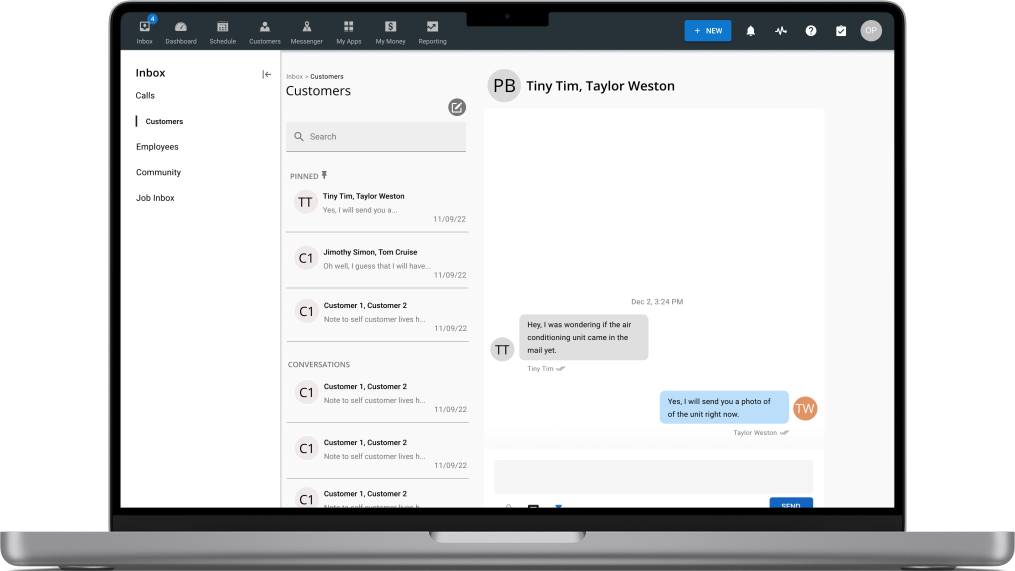
Pros has multiple issues with our in-house messaging experience:
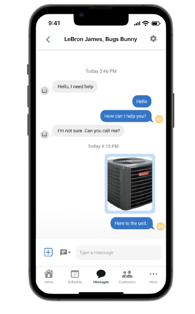
Images would send immediately after you selected one to attach— users couldn’t make sure it was the image they wanted to send
It was difficult to sort conversations
It was difficult to find older conversations
The Problem ✗
The Solution ✓
Recognizing these problems I pursued designing these features…
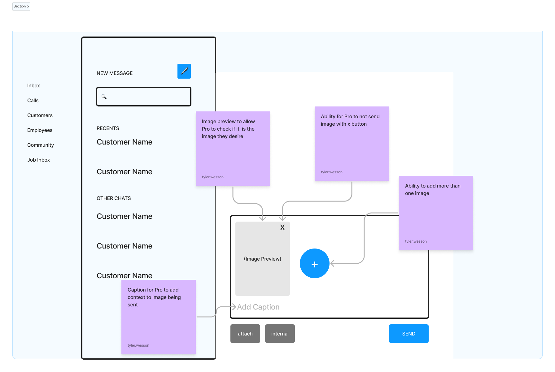
Attached images populating the text box before sending
Ability to pin conversations
A search bar to find conversations
The process
The process
01 Research
To get some insight into the issues without current chat experience, I created a script to guide Pros through the product and conducted 3 live user interviews
After a few rounds of live user interviews, I gathered that:
1/3 Pros struggled to add employees to the chat
3/3 Pros wanted a better way to find older conversations
Pros were not able to select images without them immediately being sent- a major pain point
02 Wireframing
After presenting my research findings to to my product manager and senior designers, I began wireframing to structure how my features would look
Some of the things I had to consider were :
Consistency- I had to make sure the user experience was consistent with other experiences within the software.
Readability- I needed to create effectively labeled wireframes to clearly communicate my ideas to my fellow designers and deve
03 Feedback → Hi-fi Mockups and component building
After another round of presenting, I received more feedback:
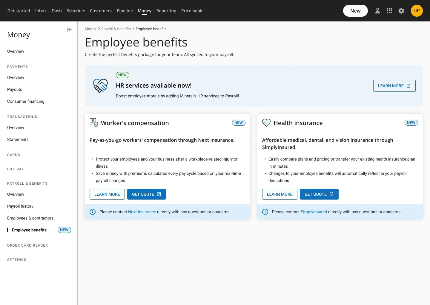
Minimize scrolling- although the size of the cards allowed for more copy, I need to design the cards in a way that allowed Pros to see as many as possible with minimal scrolling.
Interactions- What would the cards look like after the employee enrolled in benefits?
Future offerings- how do we advertise that more benefits would be available in the future within the suite?
Based on the feedback, I made new designs with:
New card sizes that could fit the same amount of text, but would be able to stack in a single row (as compared to one card taking up the same amount of space).
An after-state that communicated to the user that they have successfully enrolled, with space for relevant metrics.
An ad banner to communicate future offerings.
I also turned the cards and ads into components, allowing for other designers to easily implement them in their future work.
Results
Results
✅ 35 Pros enrolled in payroll benefits
✅ Ad reported 4.3% CTR (clickthru rate)
BTW- my banner design became the standard component across all Fintech experiences :